
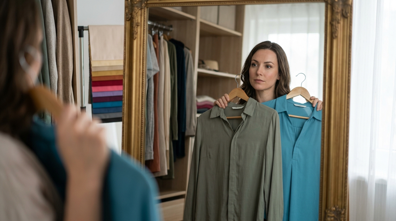
Stop buying clothes in colors that make you look tired by identifying your skin undertone and matching your wardrobe to your natural color harmony. This guide explains how to assess your undertone, select flattering neutrals, and build a cohesive capsule wardrobe. We cover practical styling strategies and professional analysis methods to help you shop with intention and clarity.
Understanding Undertone Matching
Your skin undertone is the subtle hue beneath the surface of your skin that remains consistent regardless of sun exposure or tanning. It is the primary factor in determining which colors harmonize with your complexion and which ones create a dull or tired appearance. Most people struggle with color selection because they focus on surface skin tone rather than the underlying pigment.
Identifying Your Undertone Category
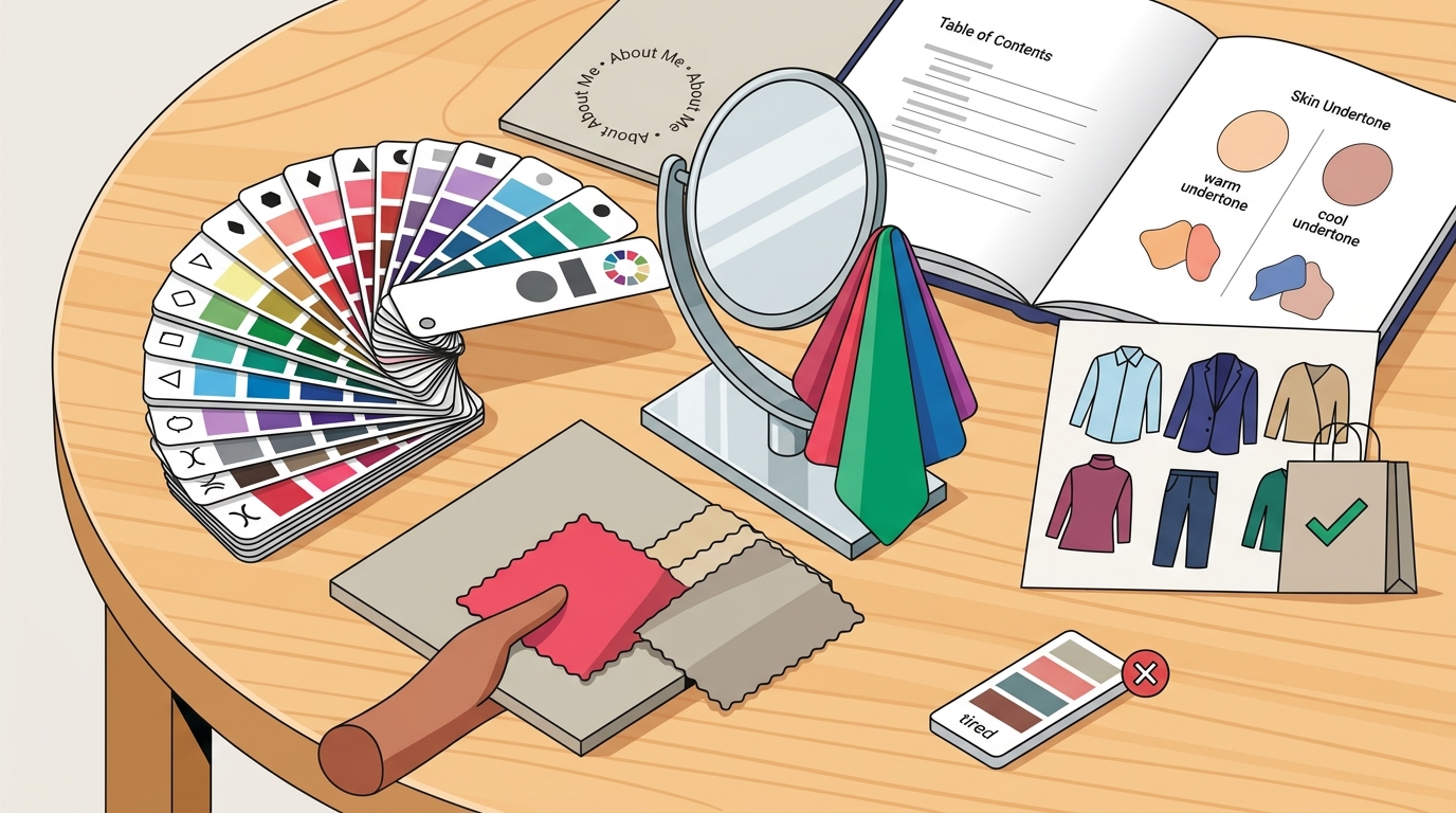
Undertones generally fall into three categories: warm, cool, and neutral. Warm undertones contain yellow, peach, or golden hints, while cool undertones feature pink, blue, or red hints. Neutral undertones are a balanced mix of both. Identifying your category is the first step in stopping the cycle of buying clothes that wash you out.
Professional color analysis at ATX Color Studio uses systematic draping to reveal how your skin reacts to specific hues. This method is far more accurate than home tests, which are often influenced by lighting and skin thickness. By understanding your undertone, you can immediately eliminate colors that clash with your natural coloring.
Why Undertone Matters for Clothing
Clothing colors reflect light onto your face. When a color clashes with your undertone, it can create shadows under the eyes, emphasize redness, or make your skin appear gray and lifeless. This is why a color that looks vibrant on a hanger or in a store mirror might make you look exhausted in natural daylight. Matching your clothing to your undertone ensures that the colors you wear support your natural radiance rather than competing with it.
Choosing Flattering Neutrals
Neutrals are the foundation of most wardrobes, yet they are the most common source of color mismatch. A neutral is a color that is low in saturation and can be worn with almost anything. However, not all neutrals are created equal. The specific shade of black, gray, navy, or beige you choose will either enhance your complexion or drain your energy.
The Problem with Pure Black
Pure black is a deep, high-contrast color that can be overwhelming for lighter or softer complexions. If you have a light or warm undertone, wearing black close to your face can create a stark contrast that makes your skin look pale or tired. Instead of discarding your black items, consider styling them away from your face. Pair black pants or shoes with a top in a softer, more flattering shade.
Selecting Your Best Neutrals
For warm undertones, softer neutrals like cream, camel, olive, or warm gray often work better than stark black or cool gray. For cool undertones, crisp white, charcoal, or navy may be more harmonious. The goal is to find neutrals that sit in the same value and intensity range as your natural coloring. This creates a balanced look that feels effortless and polished.
Building a Cohesive Capsule Wardrobe
A capsule wardrobe is a small collection of versatile clothing items that work together in multiple combinations. Building a capsule wardrobe based on your color palette helps you stop buying clothes in colors that make you look tired because every piece is chosen with intention. This approach reduces decision fatigue and ensures that you always have something to wear that looks good on you.
Start With Your Best Colors
Begin by identifying your top five to ten most flattering colors. These are the shades that make your skin glow and your eyes brighten. Use these colors as the primary hues in your wardrobe. You do not need to own every item in these colors, but they should form the core of your daily outfits. This ensures that you are wearing your best colors most of the time.
Integrating Off-Palette Items
You do not have to throw away every item that is not in your palette. If you love a specific piece of clothing that is outside your best colors, you can still wear it by adjusting the rest of your outfit. Pair an off-palette top with a bottom in one of your best colors, or add jewelry and accessories that bring your best colors near your face. This strategy allows you to keep the pieces you love while maintaining overall color harmony.
The Role of Professional Color Analysis
Professional color analysis is a visual assessment that determines your exact seasonal palette based on your skin, hair, and eye coloring. It goes beyond simple undertone identification to consider value, intensity, and contrast. This level of detail is what allows you to make precise color choices that consistently flatter your appearance.
Why DIY Methods Fall Short
Online quizzes and home tests often lack the precision needed to determine your exact season. Factors like makeup, lighting, and photo filters can distort your true coloring. A professional analyst uses controlled lighting and a wide range of drapes to see how your skin responds in real time. This ensures that your results are accurate and actionable.
At ATX Color Studio, we use the 23-Season method, which provides a highly specific and individualized result. This advanced system helps you understand not just your season, but the nuances of your coloring. This knowledge empowers you to shop with confidence and avoid colors that do not work for you.
Practical Styling Strategies for Daily Wear
Knowing your colors is only half the battle. You also need to know how to style them effectively in your daily life. These practical strategies help you apply your color knowledge to real-world situations, from office wear to casual outings.
Placement and Proximity
The placement of color matters. Colors worn close to your face have the most impact on your complexion. If you are wearing a color that is not in your best palette, try to keep it away from your face. Use your best colors for tops, scarves, or jewelry that sit near your face, and use off-palette colors for bottoms or accessories.
Layering for Balance
Layering is a powerful tool for balancing color. If you are wearing a dark or clashing outer layer, add a lighter or more flattering layer underneath that is visible near your face. This creates a frame that highlights your best features. You can also use layering to transition between seasons, adjusting your color intensity to match your natural coloring.
Key Takeaways
- Your skin undertone is the primary factor in determining which colors make you look tired or vibrant.
- Neutrals should be chosen based on their harmony with your undertone, not just their versatility.
- Building a capsule wardrobe around your best colors ensures you always have flattering options.
- Professional color analysis provides the precision needed to make accurate color choices.
- You can still wear off-palette items by styling them away from your face or balancing them with your best colors.
- Placement and proximity of color to your face significantly impact your overall appearance.
- Layering allows you to balance clashing colors and highlight your best features.
- Consistent use of your best colors reduces decision fatigue and increases your confidence in your wardrobe.
Frequently Asked Questions
How do I know if a color makes me look tired?
If a color makes your skin look gray, emphasizes shadows under your eyes, or highlights redness, it is likely clashing with your undertone. Take a photo in natural daylight to see how the color affects your complexion.
Can I wear black if it is not in my palette?
Yes, you can wear black by keeping it away from your face. Pair black bottoms or shoes with a top in one of your best colors to maintain harmony.
What is the difference between undertone and skin tone?
Skin tone refers to the surface color of your skin, which can change with sun exposure. Undertone is the subtle hue beneath the surface that remains consistent. Undertone is the key to color matching.
How accurate are online color analysis quizzes?
Online quizzes are often inaccurate because they cannot account for lighting, makeup, or the full range of your coloring. Professional draping is the most reliable method for determining your season.
Do I need to throw away clothes that are not in my palette?
No, you do not need to throw them away. You can style them by pairing them with your best colors or keeping them away from your face.
What is the 23-Season color analysis method?
The 23-Season method is an advanced color analysis system that provides a highly specific and individualized result. It considers value, intensity, and contrast to determine your exact seasonal palette.
How can I use my color palette when shopping?
Use your color palette as a guide for selecting tops, dresses, and accessories that sit near your face. You can also use it to choose makeup and hair colors that complement your natural coloring.
Conclusion
Stopping the cycle of buying clothes in colors that make you look tired starts with understanding your unique coloring. By identifying your undertone, selecting flattering neutrals, and building a cohesive wardrobe, you can shop with intention and confidence. Professional color analysis provides the precision and guidance you need to make these choices effectively. If you are ready to discover your best colors, contact ATX Color Studio to schedule a session and transform your wardrobe.