

Choosing the right paint or design palette is one of the most critical decisions in any renovation or branding project. According to industry data from the National Association of Realtors, professional color consultation can increase a home's perceived value by up to 1 to 3 percent. This statistic highlights that color is not merely aesthetic but a financial asset. However, without proper testing, even the most expensive pigments can look dull or clash with existing lighting conditions. This guide provides a rigorous, step-by-step methodology to validate your color choices before committing to a full purchase.
Understanding Lighting Conditions
Color is not static. It changes dynamically based on the light source illuminating it. Natural daylight, incandescent bulbs, and LED fixtures all have different color temperatures that alter how a pigment appears. For instance, a cool gray might look stark under bright noon sun but warm and inviting under evening lamp light. To mitigate this risk, you must test your colors in the actual environment where they will be used.
Start by identifying the primary light sources in the room. Note the direction of the windows and the time of day when natural light is most abundant. If you are designing for a commercial space, consider the impact of artificial lighting on brand perception. The Illuminating Engineering Society provides extensive resources on how light temperature affects visual comfort and color accuracy. Ignoring these variables is the most common reason for buyer's remorse in interior design projects.
Preparing Your Test Surfaces
Before applying any paint or digital mockup, the surface must be clean and neutral. Dust, grease, or previous paint tones can skew your perception of the new color. If you are testing on a wall, ensure it is free of smudges and that the existing paint is in good condition. For fabric or digital assets, ensure the material is clean and the screen is calibrated.
Calibration is a critical step often overlooked by DIY enthusiasts. Color.org offers detailed guides on how to calibrate monitors for accurate color representation. Without calibration, the colors you see on your screen may differ significantly from the physical product. This discrepancy can lead to costly mistakes, especially in branding where consistency is paramount. Always use a color calibration tool or software to ensure your digital workspace is accurate.
Applying Samples Correctly
When testing physical paint, do not rely on small swatches. Apply a large sample, at least 12 inches by 12 inches, to the wall. This size allows you to see how the color interacts with the surrounding elements and lighting. Apply the sample in two coats to ensure the true color is revealed. Thin coats often appear lighter and less saturated than the final result.
For those exploring digital design tools, consider using augmented reality apps that allow you to visualize paint colors in your space. Benjamin Moore's Color Visualizer is a popular tool for this purpose. However, digital simulations should always be validated with physical samples. The texture of the wall and the sheen of the paint can significantly alter the final appearance. Always request physical samples from your supplier to verify the digital preview.
Observing Color Shifts
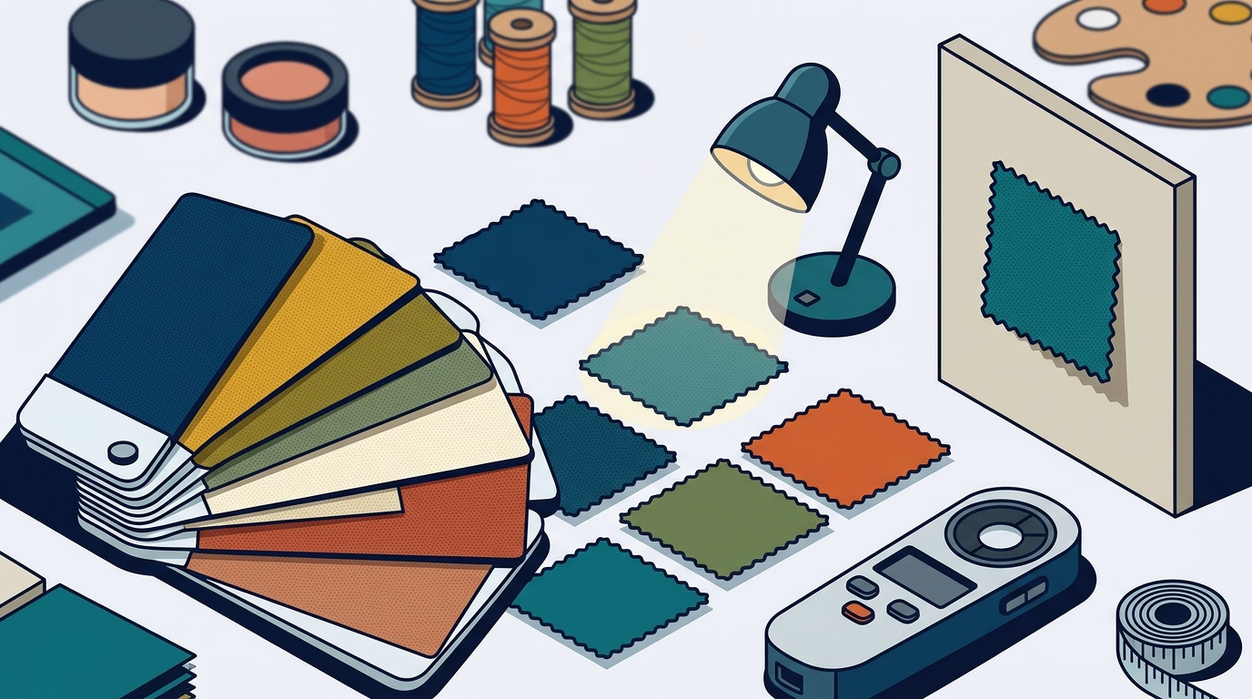
Colors shift throughout the day. A color that looks perfect in the morning might appear too dark or too bright in the afternoon. To capture this dynamic, observe your test samples at different times of the day. Morning light is cooler and more direct, while evening light is warmer and softer. This observation period should last at least 24 to 48 hours to account for variations in weather and lighting.
Pay attention to how the color interacts with fixed elements in the room, such as flooring, cabinetry, and furniture. A color that complements the wood tones in the morning might clash with them in the evening. This holistic view is essential for creating a cohesive design. Color-hex.com provides excellent resources on color theory and how complementary colors interact. Understanding these relationships can help you avoid common pitfalls and create a balanced palette.
Digital Verification Methods
In addition to physical samples, digital verification can provide valuable insights. Use design software to create mockups of your space with the chosen colors. This allows you to experiment with different combinations without the mess of paint. However, remember that digital tools are simulations and not replacements for physical testing.
For branding projects, create a comprehensive style guide that includes your chosen colors in various formats. This guide should specify the HEX, RGB, and CMYK values to ensure consistency across all media. Adobe's Color Theory resources can help you understand how these values translate across different platforms. Consistency is key to building a strong brand identity, and rigorous testing ensures that your colors remain true to your vision.
When to Seek Professional Help
While DIY testing is effective, complex projects may benefit from professional expertise. Professional color consultants have the experience to identify subtle nuances that might be missed by the untrained eye. They can also provide insights into current trends and timeless palettes that enhance the value of your property or brand.
At ATX Color Studio, we specialize in helping clients navigate these complexities. Our team uses advanced color analysis tools and years of experience to ensure your choices are both beautiful and functional. Whether you are renovating a home or rebranding a business, our consultation services provide the clarity you need to make confident decisions. Visit our services page to learn more about how we can assist you.
Key Takeaways
- Lighting conditions drastically alter color perception; always test in the actual environment.
- Apply physical samples in two coats for accurate color representation.
- Observe samples over 24 to 48 hours to account for daily light variations.
- Calibrate digital devices to ensure accurate color simulation.
- Consider professional consultation for complex branding or architectural projects.
- Use augmented reality tools as a preliminary step, not a final verification.
- Document your chosen colors in multiple formats for brand consistency.
Frequently Asked Questions
How long should I wait before deciding on a paint color?
You should observe your test samples for at least 24 to 48 hours. This period allows you to see how the color changes with different lighting conditions throughout the day and night. Rushing this process can lead to dissatisfaction with the final result.
Can I trust digital color visualizers?
Digital visualizers are useful for preliminary exploration but should not be relied upon for final decisions. Screen calibration and monitor differences can significantly affect how colors appear. Always verify digital choices with physical samples.
What is the best way to test colors in a room with multiple light sources?
Test the color at different times of the day when each light source is active. Observe how the color shifts under natural light, overhead lighting, and accent lighting. This comprehensive approach ensures the color works in all scenarios.
Do I need to prime the wall before applying a test sample?
If the wall is clean and in good condition, priming may not be necessary for a small test patch. However, if the wall is porous or has a different sheen, priming ensures the test sample accurately reflects the final result. Consult with a professional if you are unsure.
How does ATX Color Studio help with color testing?
ATX Color Studio offers professional color consultation services that include on-site analysis, digital mockups, and physical sample recommendations. Our experts guide you through the testing process to ensure your choices align with your vision and functional needs. Learn more on our about page.
What is the difference between HEX, RGB, and CMYK color values?
HEX and RGB are used for digital screens, while CMYK is used for print. Understanding these differences is crucial for maintaining color consistency across digital and physical media. Our team provides detailed color specifications to ensure accuracy in all formats.
Ready to Transform Your Space?
Testing colors before you buy is a critical step in ensuring your project's success. By following these steps, you can avoid costly mistakes and achieve a result that you love. For expert guidance and professional color analysis, contact ATX Color Studio today. Let our team help you make confident, informed decisions that enhance your home or brand.